A logo is the handshake of your brand. It is the very first thing people see. It is also the lasting impression they carry away .
Think about the golden arches of McDonald’s. Think about the sleek apple of Big Tech. These symbols do not just look good. They tell a story instantly.
How can you build a logo that captures attention and never lets go?
1. Simple Beats Complex
Great logos are incredibly simple.
- They use few lines.
- They limit color palettes.
- They remain recognizable anywhere.
- They work on huge billboards.
- They work on tiny phone screens.
2. Colors Speak First
Color triggers immediate emotional reactions.
- Blue builds deep trust.
- Red creates urgent energy.
- Yellow radiates pure optimism.
Choose shades that reflect your true business values.
3. Typography is the Unsung Hero
Shapes grab the eyes. Fonts deliver the actual voice. Your choice of typeface dictates how people read your brand identity.
Are you corporate and traditional? Use a sturdy serif.
Are you modern and tech-focused? Go with a clean sans-serif.
But what if your brand is elegant, artistic, or premium?
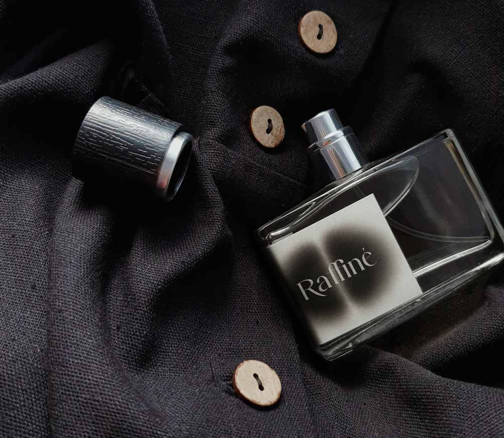
Standard fonts will make you blend in with the noise. To truly stand out, top designers look for custom typography that balances modern trends with timeless class. For instance, sophisticated branding projects often benefit from unique display typefaces like
Riverie. It injects high-end personality into logotypes effortlessly, giving packaging and wordmarks a distinctly high-fashion aesthetic.
When your lettering feels bespoke, your entire brand instantly feels more expensive.
4. Versatility is Mandatory
Your design must be a shapeshifter. It needs to look flawless on:
- Dark backgrounds.
- Light backgrounds.
- Embroidered shirts.
- Metal engraving.
If it only works on white paper, go back to the drawing board.
Craft Your Masterpiece Today
Building a memorable brand identity is a rewarding journey. Start sketching your ideas. Keep the geometry clean. Most importantly, select typography that tells your story without saying a word.